Quick dark mode with CSS filters
Some people prefer Clair, some Obscur, but we're all in this expedition together. (Sorry.)
I really like Ghost's Journal theme – so much so that I'm using it right now! The problem is I also love dark mode.
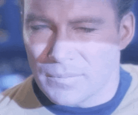
This made opening a tab with my blog feel like this:
So by now I was thinking how much time I would like to dedicate to this. I will likely create a new theme from scratch at some point but I have other priorities – like having a life since I already code to pay my bills.
So. A quick visit to DuckDuckGo lead me to this post, helpfully titled "Implement Dark Mode with One Line of CSS" – and it doesn't bury the lede either:
with filter: invert(1), which is not ideal, but it can be a starting pointWhy, thank you so much. After reading the article (and also this one) I ended up with:
@media (prefers-color-scheme: dark) {
  html,
  img,
  svg,
  video,
  canvas,
  iframe {
    filter: invert(1) hue-rotate(180deg);
  }
}
That's it. You should be good to go as as long as you have a solid colour background. You got what you were looking for. Thanks for the visit. See you soon!
A slightly more in-depth explanation
The article linked above is a great start, but I found a lot more information on "CSS Invert Filter: Complete Guide to Inverting Element Colors and Visual Effects" – I highly recommend reading it.
Either way, let's go step by step. We start with:
html {
  filter: invert(1);
}
Simple enough! The problem is this inverts the colours of absolutely everything without distinction. This means all CSS colours are inverted (blue to yellow, pink to green and so on) along with all images, videos and so on. So we don't stop here.
We can fix CSS colours with an additional filter:
html {
  filter: invert(1) hue-rotate(180deg);
}
Why? All CSS properties related to hue – or more accurately the Hue/Saturation/Brightness model – arrange colours in a wheel:
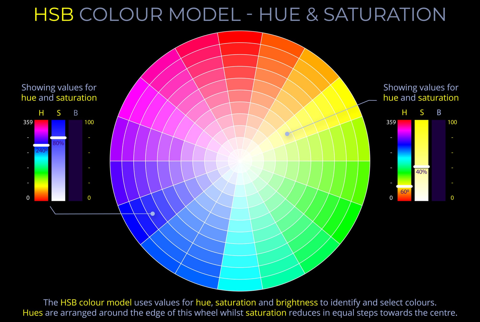
So invert(1) flips the wheel on its head and we un-flip it by passing hue-rotate(180deg). Problem solved, right? Kinda. We still need to fix images and videos. Since we're flipping colours on everything inside html, we now need to flip it all once again in all relevant elements. Hence:
html,
img,
svg,
video,
canvas,
iframe {
  filter: invert(1) hue-rotate(180deg);
}
The last step is wrapping all this on a media query to follow user preferences:
@media (prefers-color-scheme: dark) {
  html,
  img,
  svg,
  video,
  canvas,
  iframe {
    filter: invert(1) hue-rotate(180deg);
  }
}
And we're done.
Caveats
This is a quick and dirty approach that will work at a pinch, but it does have side effects. There's no easy way to make emoji colours show up correctly using invert.
Also, applying invert(1) and hue-rotate(180deg) twice seems to desaturate images a little bit and I haven't found a fix for it yet. You can see it for yourself by changing from light to dark mode in your browser's developer tools.
These drawbacks still feel like a worthy trade-off to avoid throwing a flash bang grenade at the dark mode crowd, so I'm keeping the filters until I gather motivation to build a custom theme. You're welcome.